Redesigning a financial planning dashboard that helps growing companies manage budgets, forecasts, and cash flow in real time.
Client
Renance
Role
Product design
Duration
8 weeks
Scope
UX Research, UI Design
Overview
Renance is a financial planning tool for growing companies that have outgrown spreadsheets but aren't ready for enterprise software. Their platform helps finance teams manage budgets, track spending, and forecast cash flow — all in one place.
The existing dashboard had all the data but none of the clarity. Finance teams were spending more time interpreting the interface than actually making decisions.

The Challenge
Renance's dashboard was built by engineers who prioritized data completeness over data clarity. Every metric was visible, but nothing was prioritized. Users couldn't answer the most basic question quickly: 'Are we on track this month?'
Specific issues:
• Information overload — 40+ data points visible on the main dashboard with no hierarchy
• No actionable insights — data was displayed but never interpreted or contextualized
• Poor mobile experience — finance directors checking numbers between meetings couldn't use the dashboard on their phones

The Approach
I worked closely with Renance's finance advisory board — 5 CFOs and controllers who used the product daily. The key insight from research: finance people don't want to see all the data. They want to see what changed, what needs attention, and what's on track.
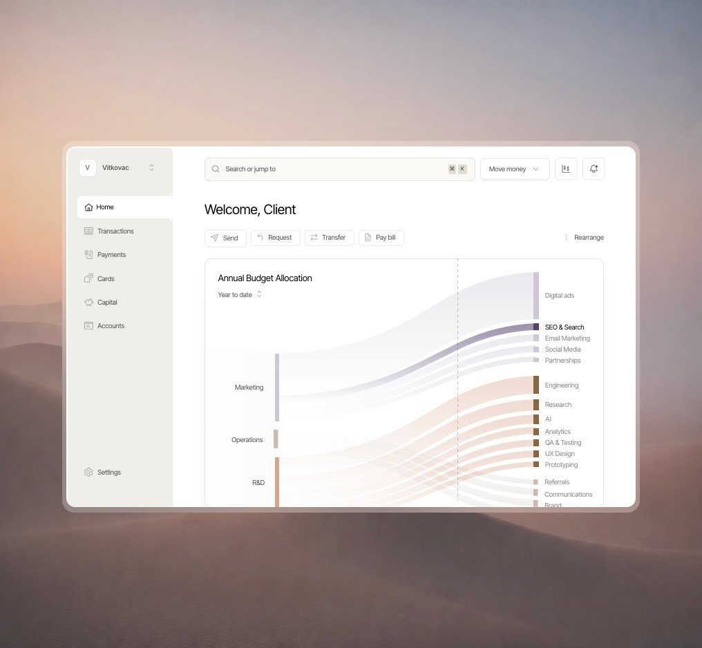
Priority-based layout
Restructured the dashboard around three questions: What needs attention now? How are we tracking against budget? What's coming next month? Each section answered one question clearly without requiring users to dig through charts.
Smart data visualization
Replaced generic bar charts with contextual visualizations. Budget allocation got a clear over/under indicator. Cash flow got a trend line with forecast overlay. Every chart was redesigned to tell a story, not just display
Mobile-first executive view
Designed a dedicated mobile experience that showed the 5 most critical metrics with swipe-to-drill-down for details. Finance directors could check company health in 30 seconds between meetings.

The Results
The redesigned dashboard became Renance's primary selling point. User satisfaction jumped dramatically. Average daily usage quadrupled — from frustrated scanning to engaged decision-making. Churn dropped significantly in the first quarter after launch.